Qonnections 2017 was this past week, and it was a whirlwind of a conference. Qlik debuted all kinds of new features and plans for their products that left a big impression on the attendees. As a developer who focuses on Qlik’s APIs, there were 3 things that stood out to me the most:
Picasso
Qlik demonstrated a new visualization framework that they are creating called Picasso. Picasso is a declarative approach to custom visualization. As a developer, you write a JSON spec that describes what your visualization should look like. Picasso is then able to parse that spec and output a visualization to either SVG or Canvas. It is very similar to Vega-lite, although it appears to have better support for responsive design.
If Picasso is executed properly, it should enable developers to build custom charts much faster than they can today, and also easily share and modify charting code as well. Very much looking forward to playing with this one.
Offline mode
During Josh Good’s talk on his 5 favorite things coming in June, Vinay Kapoor had the audacity to interrupt with a 6th favorite thing. He didn’t disappoint as he showed the Qlik Engine running offline on mobile devices. Via a Qlik Sense native app, he was able to sync his mobile app with a QVF on a server and then use that app offline, taking full advantage of the Associative Model. The ability to run QIX on a mobile device has huge implications for what the Engine can be used for – I can imagine a future where you build a mobile app that has nothing to do with dashboarding but uses the QIX Engine to power its data experience.
The Diversity and Quality of the Hackathon Submissions
I attended the very first Qlik Hackathon in Orlando in April 2014. Qlik Sense and its APIs had just been released, so the developers assembled that day found themselves facing an uphill battle as they wrestled with a brand new technology. Some interesting solutions came out of that day – two that I specifically recall are Ralf Belcher and Torben Seebach implementing a D3 chord diagram working in an extension, and Jason Mondesir and myself creating a table with minigraphics that could be adjusted by the user. While these solutions were a good first step, they were just the tip of the iceberg for what could be accomplished with the APIs.
Fast forward a few years and you can see the massive progress of the Qlik web dev community in the latest Hackathon. This year’s challenge was to visualize conflict data from Africa, and the results from the 6+ teams dazzled. They included a cloud heat map with MapBoxGL, a search bot, a refugee migration map, and several variations on network diagrams.
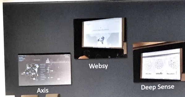
A few of the Hackathon submissions
It was amazing to see how far the community has come and the creative solutions they produced with the APIs. I can’t wait to see what’s next from this group.
I’m also super proud of the Axis Group team for taking home the Hackathon’s top award and want to recognize the following people who contributed significantly to the project but weren’t recognized at the conference: Gen Ellsworth, Liza George, Manasvi Lalwani, Jessie Lian, Scott Reedy, and Tim Wright.