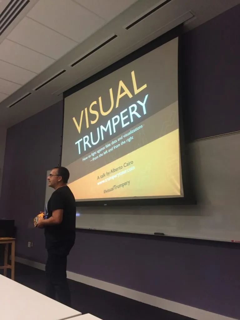
Last month, the Atlanta Data Visualization meetup hosted Alberto Cairo at Georgia Tech as part of his Visual Trumpery lecture tour. On this tour, Alberto is speaking about the proper and ethical use of visualization and how to detect and deter fake visualization. We were very excited in Atlanta to be the first US city to host this talk.
“Visual Trumpery” is an insightful lecture that I recommend to anyone with an interest in the communication of data. Alberto presents his arguments passionately, with numerous examples that engage the audience and make his points tangible. He also recommends resources along the way for those interested in going deeper; these seemed to be a big hit as many of the questions in the Q&A turned back to these resources and how people could learn more.
The lecture centers around the concept of “graphicacy”, a distinction Alberto places as coming logically after literacy, articulacy, and numeracy. The idea of being “graphicate” involves the ability to interpret a visualization and determine what it is and is not telling you, without being fooled by your own personal biases or by tricks put in by the author. Alberto introduced two points around “graphicacy” that especially resonated with me:
-
We must do a better job of evaluating the legitimacy of sources before we share them. I am guilty of breaking this rule; with social media, it is so easy to share a chart that comes across my feed without assessing its credibility. The better the chart aligns with my own biases, the faster I seem to reach for the retweet button.
-
We must be more cognizant of the uncertainty in data and ensure that it is communicated properly. The 2016 presidential election comes to mind here. There were many issues with how uncertainty was handled by the media and conveyed to the public, thus causing frustration all around. In some places the media was overconfident in it’s predictions; in other places, people did not understand the uncertainty of the predictions they were receiving, causing backlash against models that weren’t so bad (see the FiveThirtyEight’s forecast). The Visual Trumpery tour is continuing in the US in October – if you have a chance to attend, take it. Tour dates and other information can be found at https://visualtrumperytour.wordpress.com/.
If you are in the Atlanta area, please consider joining the Atlanta Data Visualization meetup. We meet a few times a year to learn about visualization work happening around the community. We are always looking for speakers, so if you have a topic or project you want to present about, please don’t hesitate to contact me.