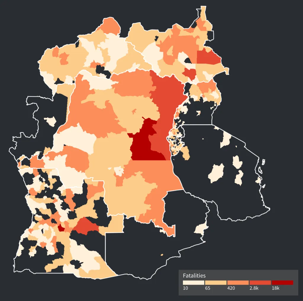
 Fatalities from conflicts in the DRC and its neighbors
The Visual Analytics team at Axis Group recently won a data viz hackathon with an exploratory visualization tool for analyzing conflict data in and around the Democratic Republic of Congo. I’m very proud of the work that our team did and can’t wait to share the full application as well as blog posts on some of the design and technical lessons we learned along the way. The application needs a little cleanup before it goes live, but in the meantime I’ve received a lot of questions about the solution so I’d like to share some info here as a preview.
The Hackathon
At Qlik’s annual Qonnections conference this year, Qlik Branch partnered with the UN to host a hackathon. The goal of this hackathon was to take an open set of data provided by Qlik and the UN and produce a visual tool for exploring that data set to answer key questions. The UN provided a data set from the Armed Conflict Location & Event Data Project that provided information on conflict events that have happened in Africa in the last 20 years. The event data includes information on associated fatalities, key actors in the events, location and timing, and notes with a description of the event.
The Hackathon participants had 2 weeks to load the data into Qlik’s platform and use the Qlik API’s to produce a visual analysis that the UN could use to answer key questions about the dataset, such as:
- how have the major actors changed over time?
- where is the violence happening, and how are civilians impacted?
- which actors operate across country borders?
For the scope of the project, the UN placed an emphasis on the conflict going on in the Democratic Republic of Congo. The dataset reveals the horrible nature of these conflicts and the effects on innocent civilians. In our visualization design we sought to provide analytical tools for exploring this data while staying true to the reality of the situation and conveying the horrors of the events.
Evolution of the Conflicts Over Time
The dataset provided goes down to the individual event level at its most granular level. This level has participating actors tagged to it – these actors include government forces, political militias, rebels, protestors, etc. We wanted to take this data and use it to show how the conflict has changed over time.
From our initial analysis of the data, one thing became extremely clear: the conflict data is messy because the situation is messy. As we looked at the data from year to year, we saw a constant tide of new actors coming in and out of the picture. Part of our human nature is to be drawn to stories, and in many of our stories there is a common theme of a good guy vs. a bad guy. Unfortunately, reality is much more complex than this and we wanted to convey that complexity to our audience. We also wanted them to feel the cumulative impact of all of this conflict on the region, while giving a user the opportunity to interact with the data and explore it at will.
With that goal in mind, we produced an interactive map that animates the build up of conflicts over the 20 year period from 1997 to 2016:
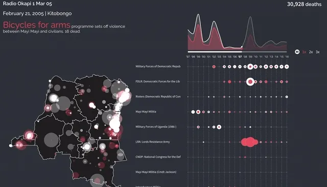
Animating events year over year in the DRC
The view above behaves like a video and an interactive visualization simultaneously. As the screen animates, you can interact with any data point on the screen, such as hovering the the individual events on the map to see more details in a tooltip. The list of top actors on the right side resorts itself based on year so that you can see the rapid changes in the main perpetrators in the country. In this screenshot, you can see the LRA rise to the top and witness their outpouring of violence on civilians in the top right corner of the country. Key notes from the data set are highlighted in the top left to give some extra details on the kind of violence that is being seen from year to year.
While it animates like a video, you can also stop the animation and go back and forth to any point in time using the line chart. This feature makes it easy to switch between passively observing the evolution and actively exploring the data at key points in time.
The Actor Network
One key question posed in the UN’s Hackathon brief was about the interactions between actors. Specifically, they want to better understand how the actors are fighting or allying with each other and how those relationships change over time.
We wanted to answer this question with a network diagram but wanted to avoid producing a pile of spaghetti that was impossible to interpret. Specifically, we wanted readers to be able to determine:
- Who are the major plays in the network at any point in time?
- How are the actors distributed across type of actor?
- For any given actor, who are they in conflict with and who are they allied with?
- How do these relationships change year over year?
We decided to implement a network diagram with some clustering and interactivity to help answer these questions.
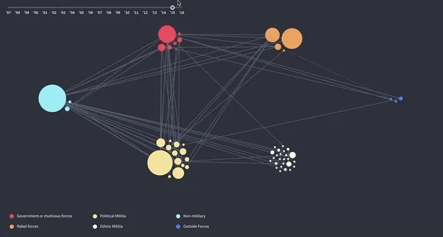
Actor interactions, colored and grouped by actor type
Each node in our network is sized by their relationship to violence – the bigger the circle, the more fatalities associated with events involving that actor. In order to clean up our network, we clustered the nodes by actor type at the overview level. The clustering allows you to see the amount and size of actors within each group. The clustering immediately brings out some questions that warrant further analysis, such as why there are no interactions between ethnic militias and rebel forces.
Animation is used as the data transitions from year to year to emphasize how the network changes. In the example above, you can see how the ethnic militia groups have a lot of turnover from year to year.
Single actors can also be focused on in the network. Hovering provides a quick glimpse of the actor’s relationships within the larger network. Clicking on the actor brings it into focus at the center of the screen and splits its relationships into two groups: conflicts to the left and alliances to the right.
The Technical Bits
This project presented new technical challenges that our team hadn’t faced before, and I’m looking forward to sharing how we overcame those challenges in future posts. These posts will include:
- Using deck.gl to map out thousands of events animating over time
- Setting up an animation timer with pause, jumping forward and backward, and replay with a combination of d3-timer and RxJS
- Creating piece-wise animation functions to calculate the visual state of events on our map at any point in time
- Using d3-force from v4 of d3 to create our network diagram
- Cleaning up our mapping data to get the appropriate region polygons for our choropleths